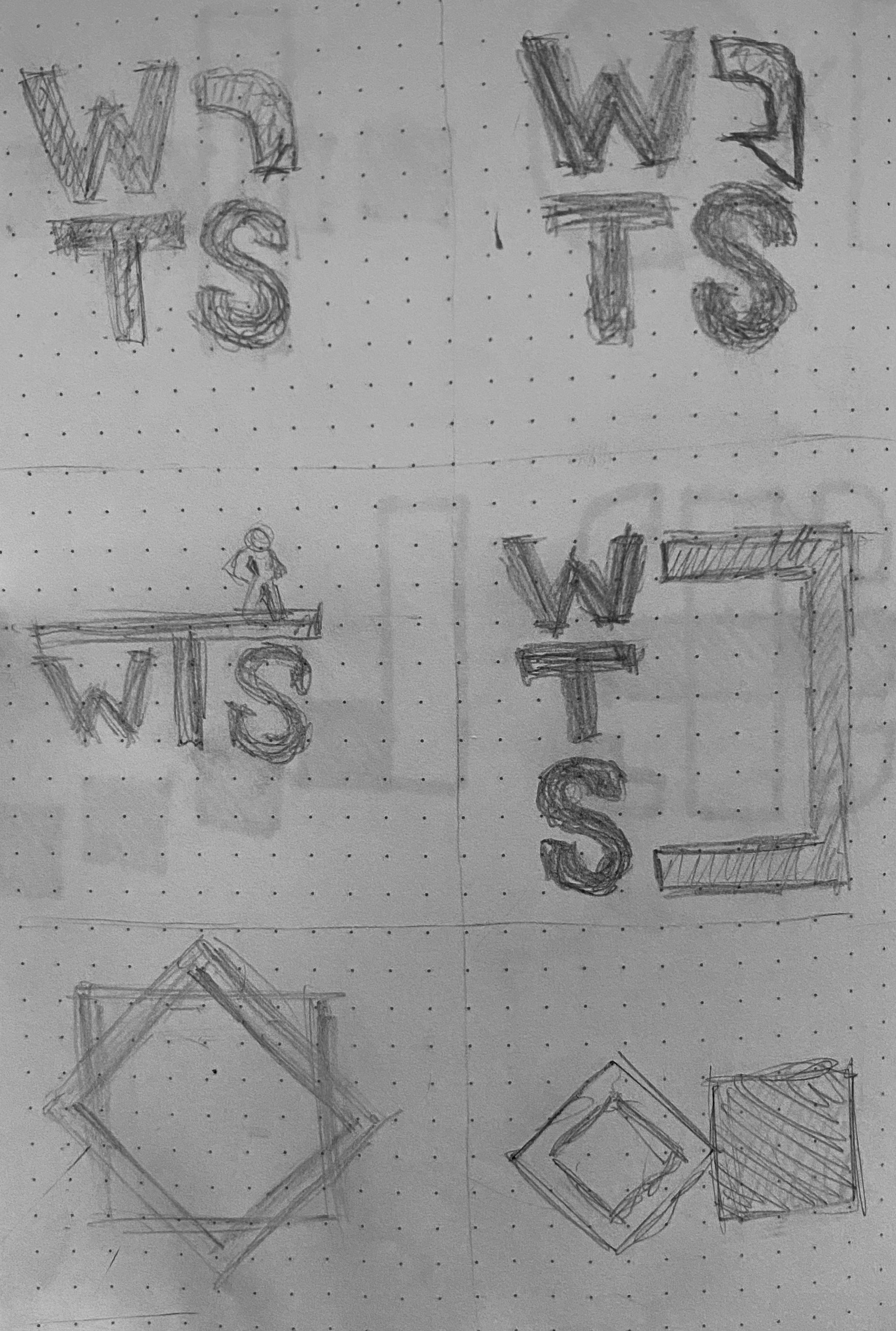
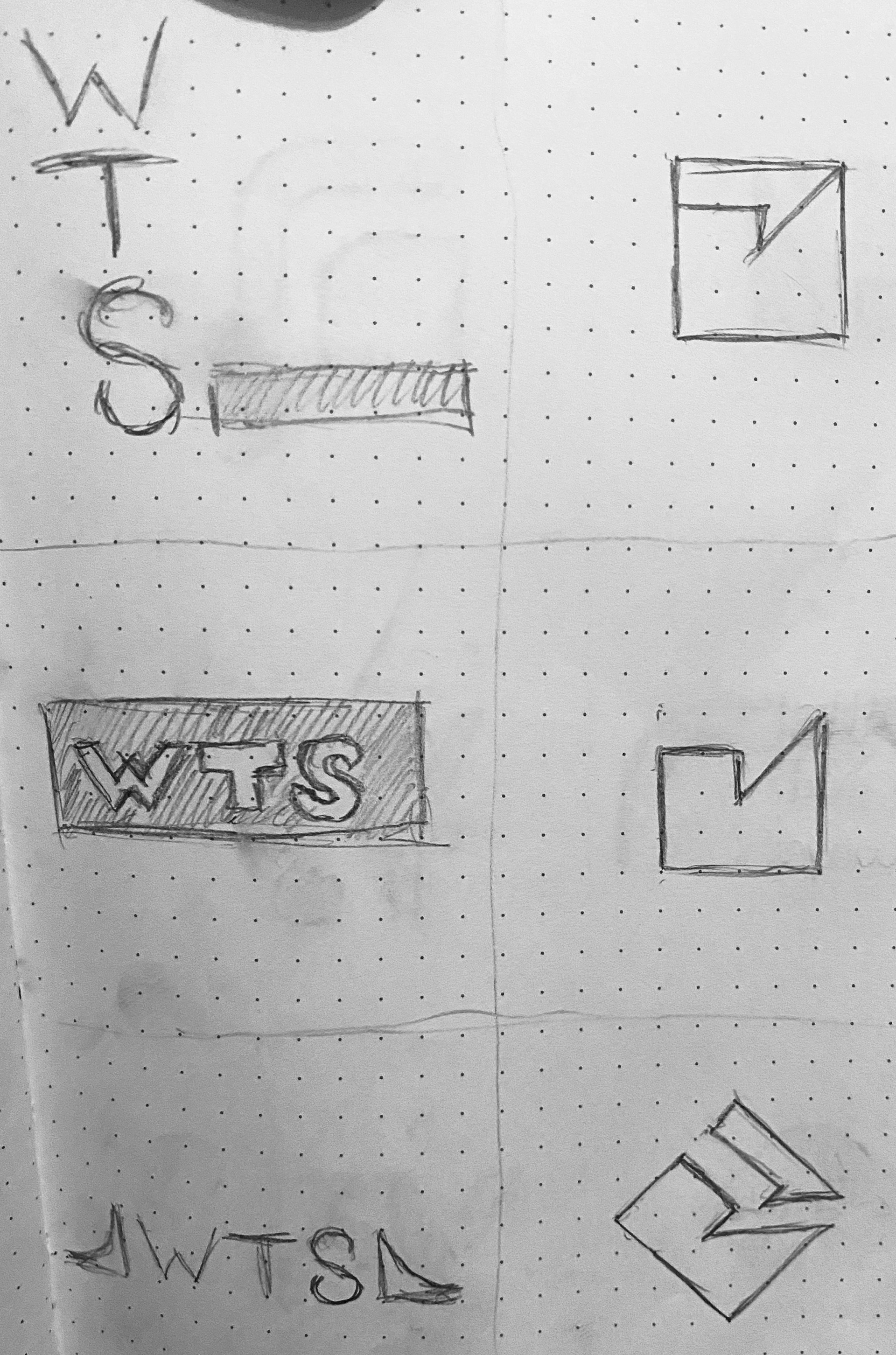
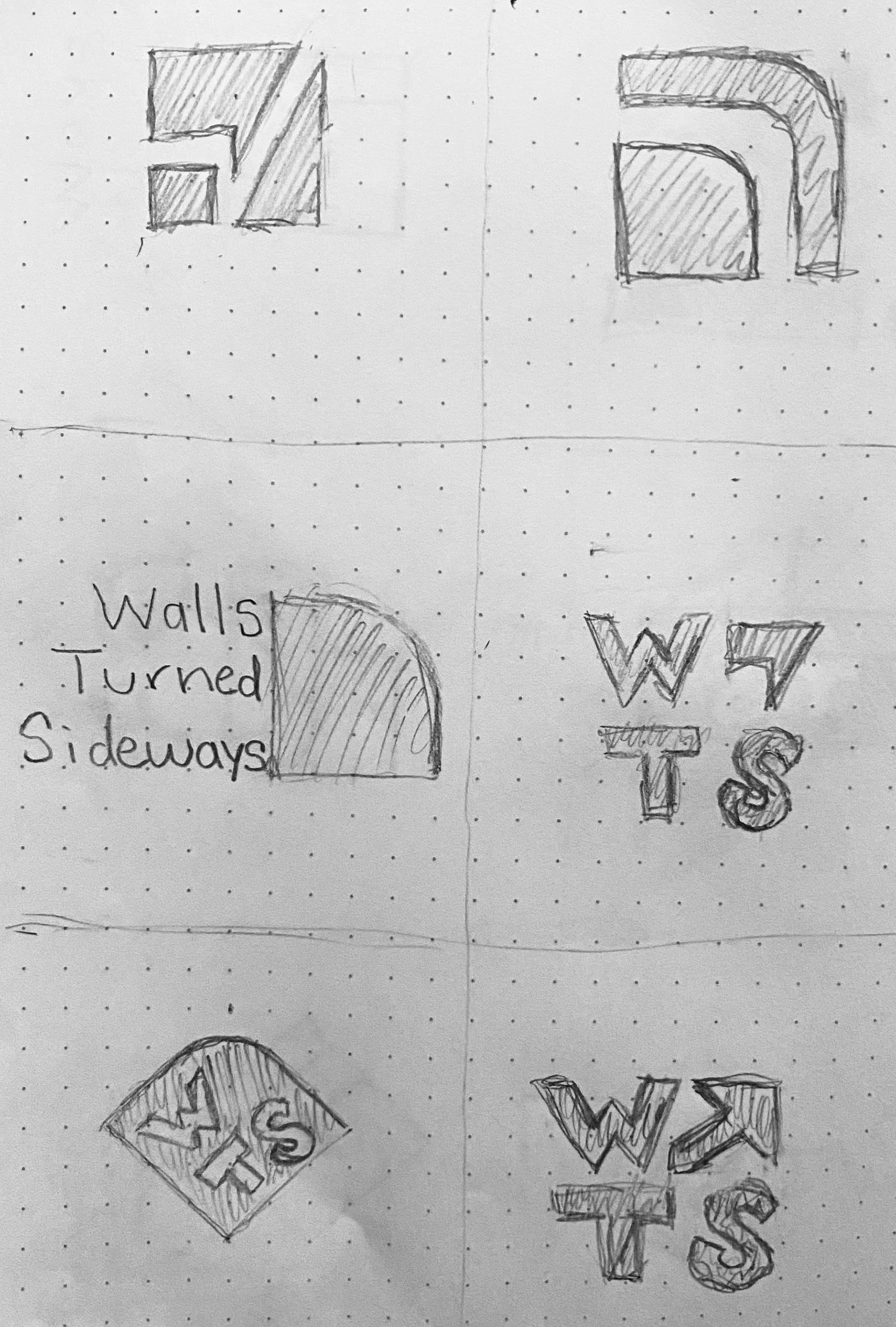
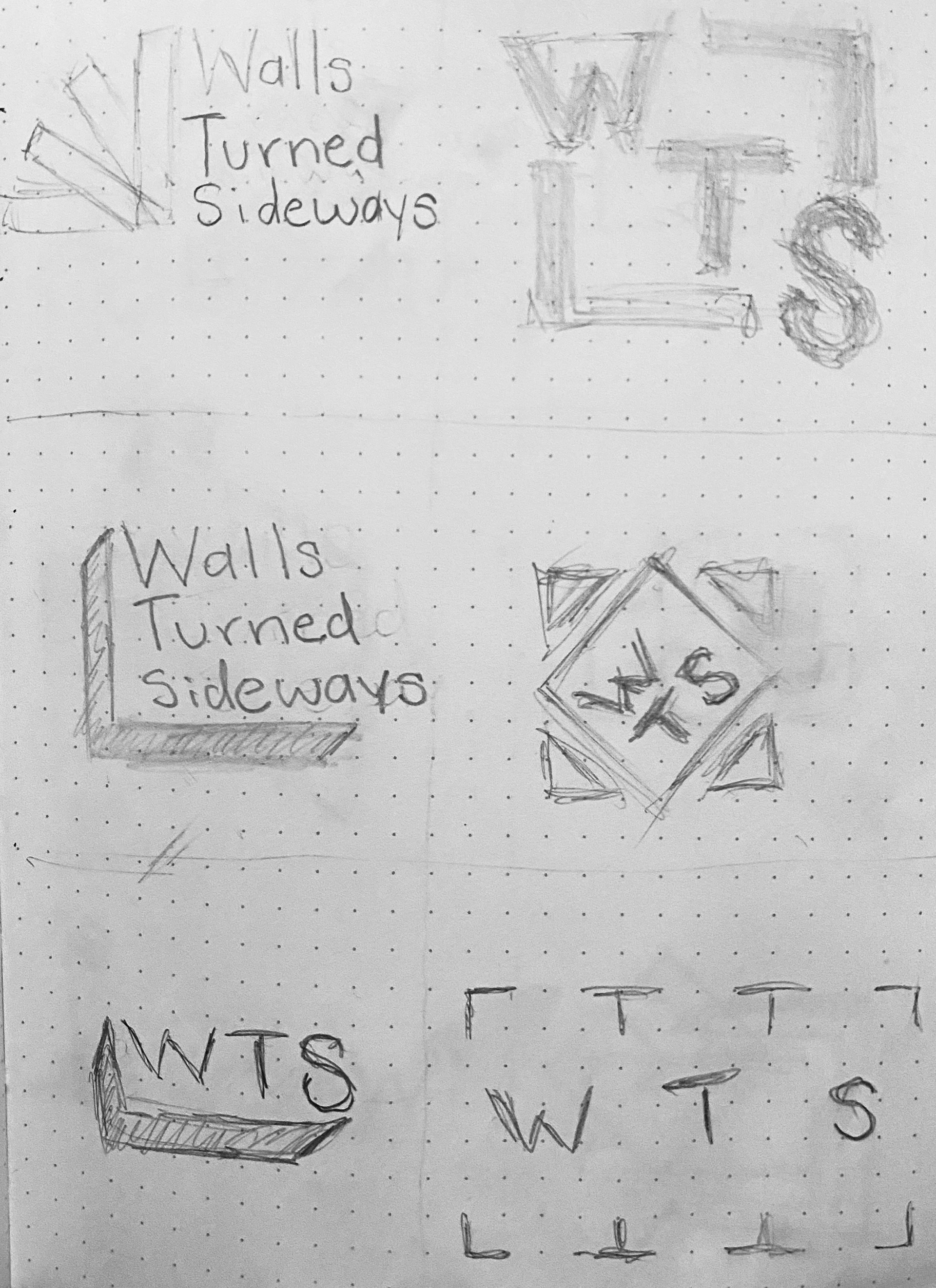
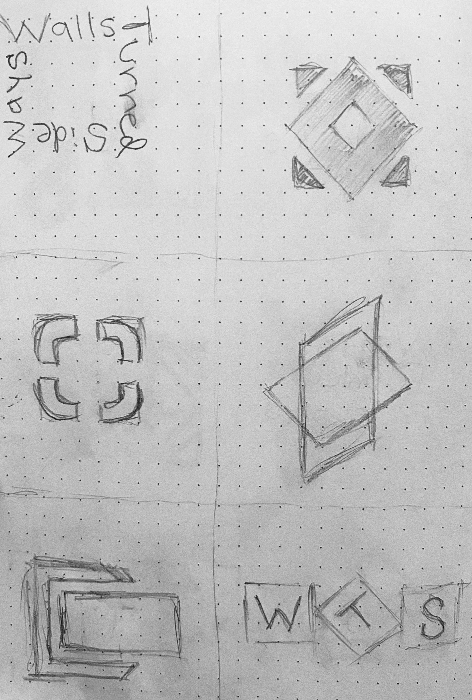
The aim of this project was to create a brand identity for the non-profit organization, Walls Turned Sideways, and to present our designs to the client directly. Walls Turned Sideways aims to bridge the gap between incarcerated individuals and the people they care for on the outside using art as a form of communication. The primary logo I designed combines the letter "W" with the shape of a wall turned to the side, which when paired with the name of the organization illustrates an arrow to demonstrate the action of forward progression. Similarly, the blue color was used to give a sense of reaching toward the sky and freedom. The primary mark when used as a pattern creates a chain link to further demonstrate the idea of linking two things together. We were also tasked with creating mockups for the organization's newly purchased headquarters and a poster to promote the building's opening event.
